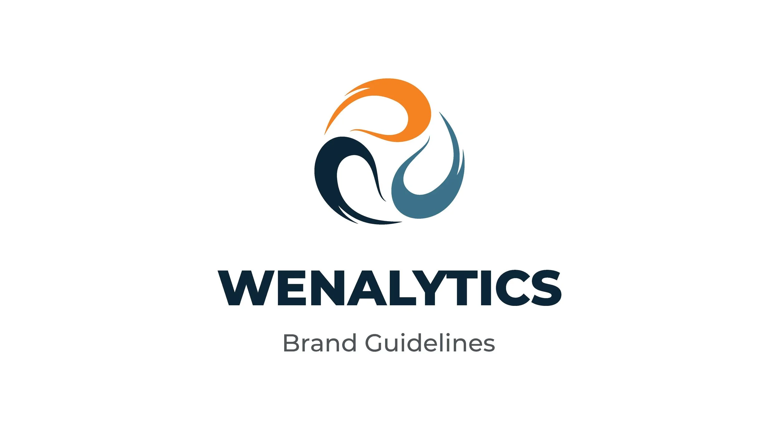
Wenalytics
Category
Rebrand
Print Design
In association with Tandemtide
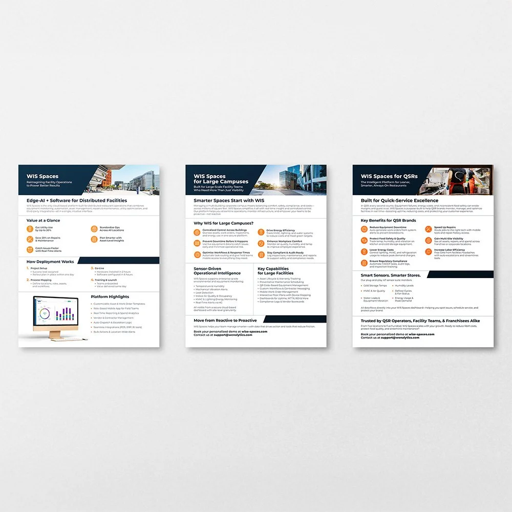
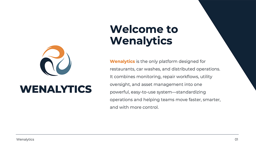
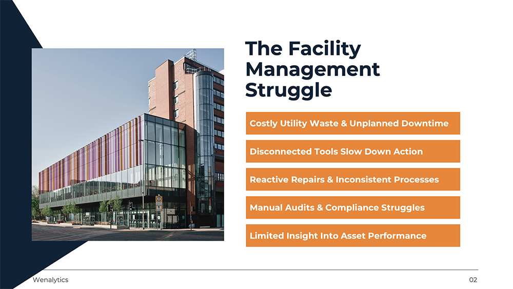
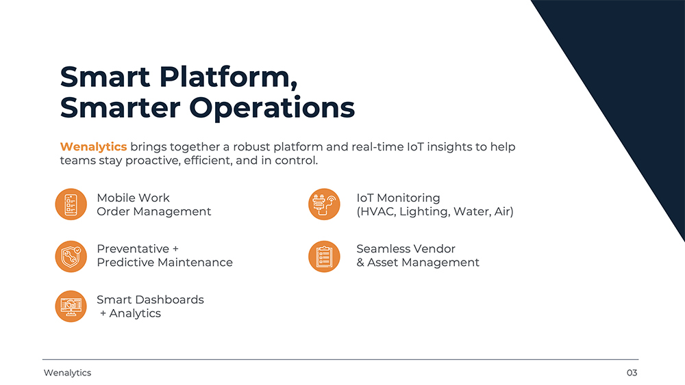
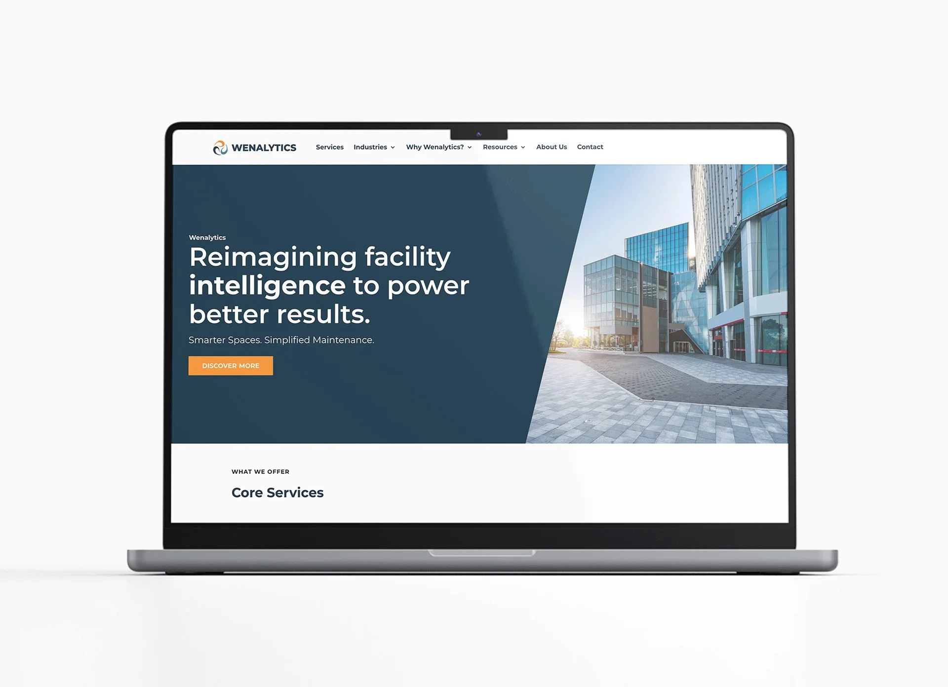
I led the creative development of the company’s transition from WIS Spaces to Wenalytics, with the help of a team, supporting a full rebrand to better reflect its focus on IoT-enabled analytics and smart building solutions. Wenalytics helps organizations collect and interpret connected data from facilities and infrastructure to improve operational efficiency, monitor performance, and drive smarter decision-making. To align the brand with this forward-thinking, technology-driven direction, I oversaw a comprehensive visual refresh including a logo redesign, updated color palette, and detailed brand guidelines. I also contributed to developing the look and feel of the new website to ensure the digital experience aligned with the refreshed identity.
Project Overview


Process
-
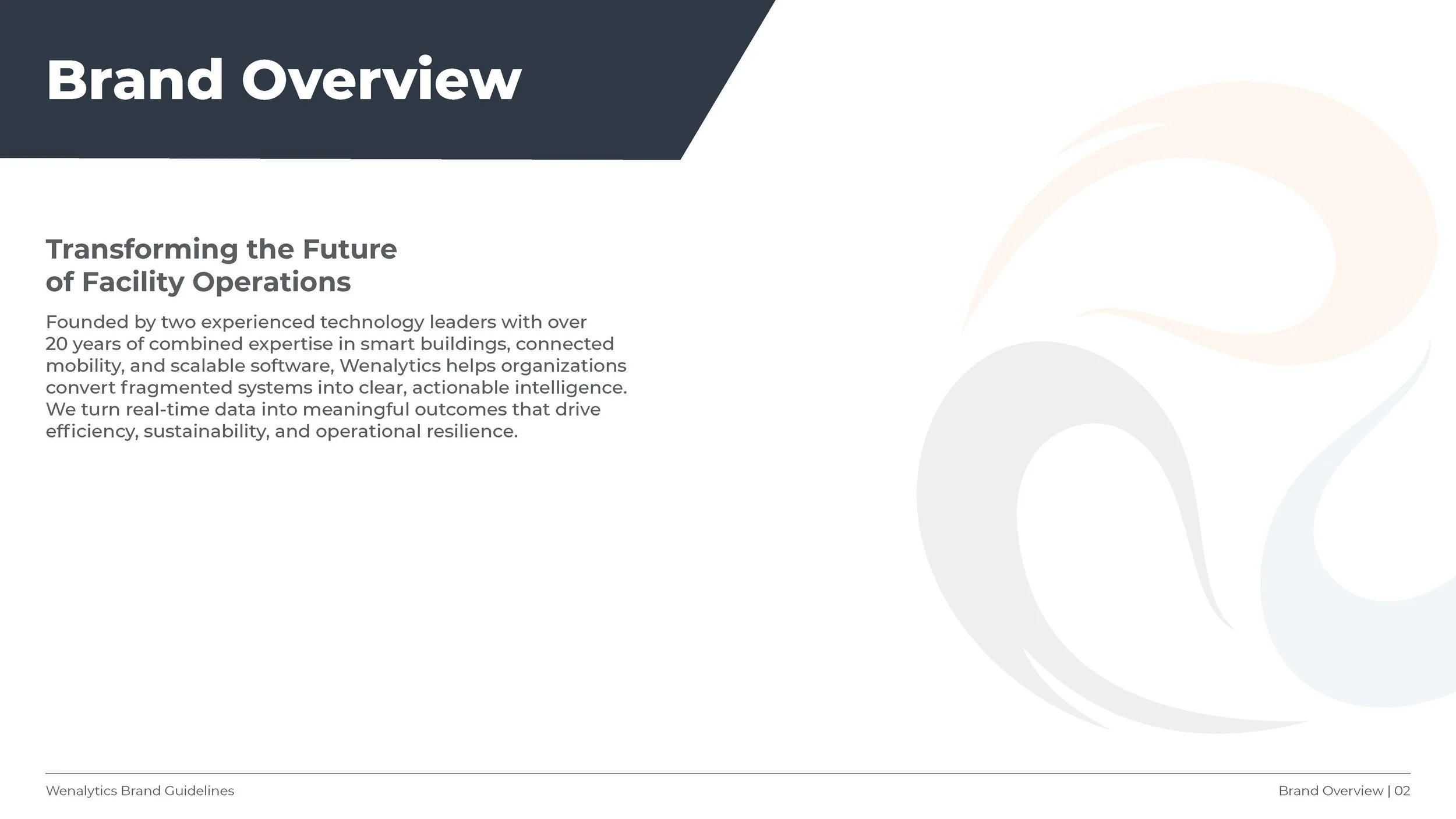
Before beginning the rebrand, I took time to understand the strategic shift from WIS Spaces to Wenalytics, including the company’s focus on wind, energy, and analytics within the clean energy and smart building space. Understanding how Wenalytics helps organizations collect and interpret connected data from facilities and infrastructure to improve operational efficiency, monitor performance, and drive smarter decision-making shaped the foundation for the creative direction. This insight ensured the new identity reflected both where the company was headed and the values guiding that evolution.
-
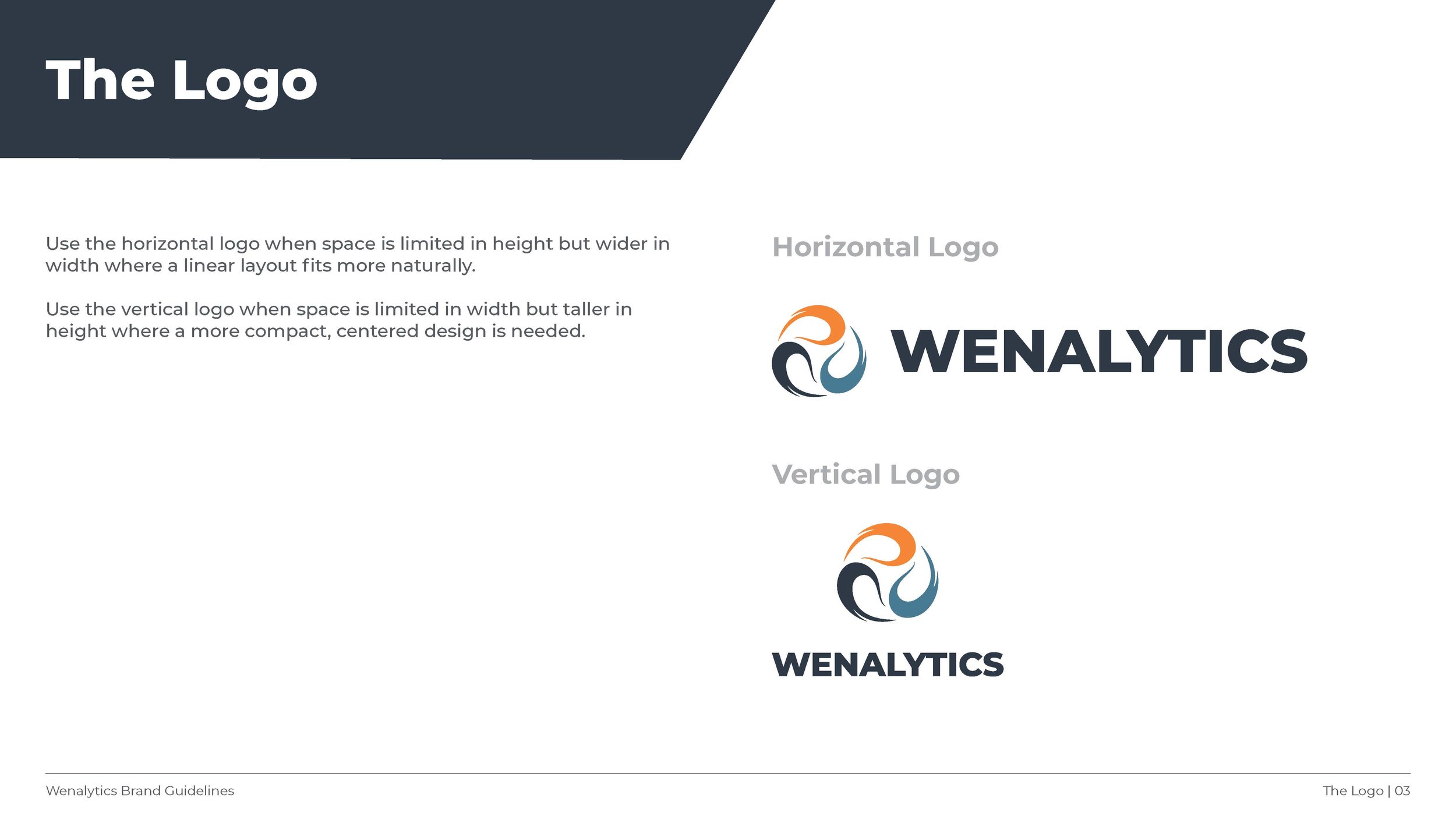
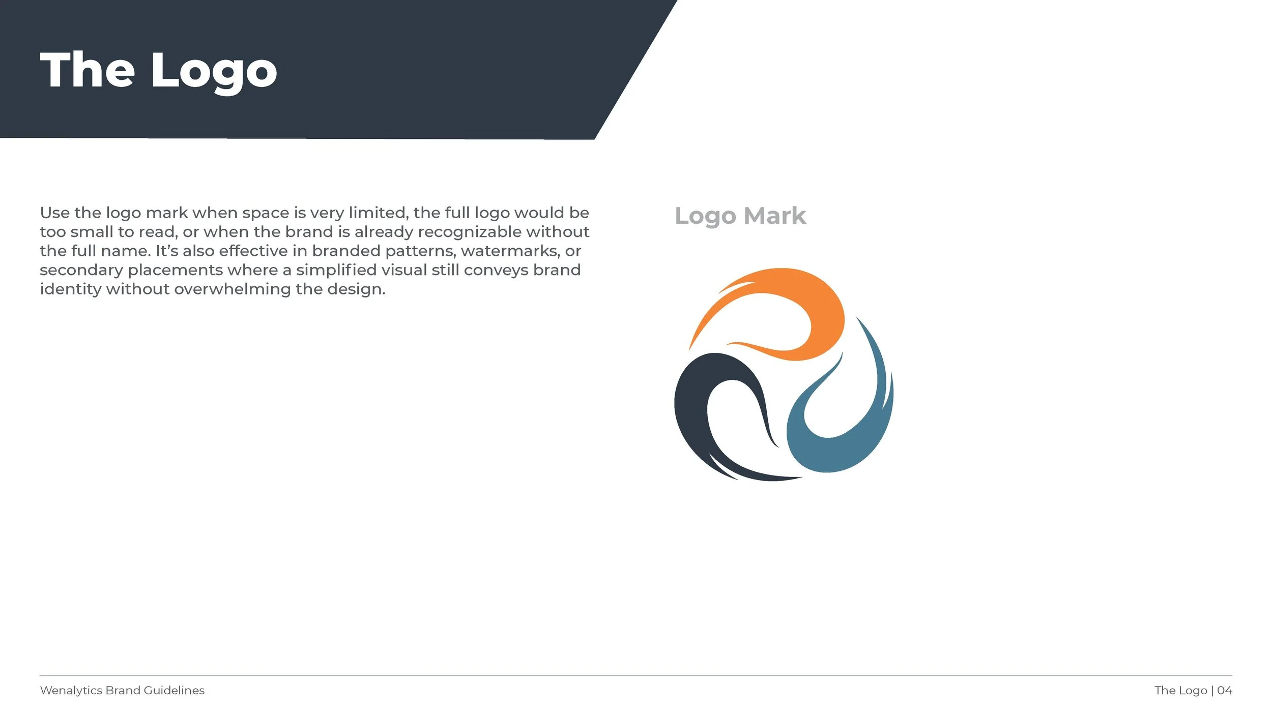
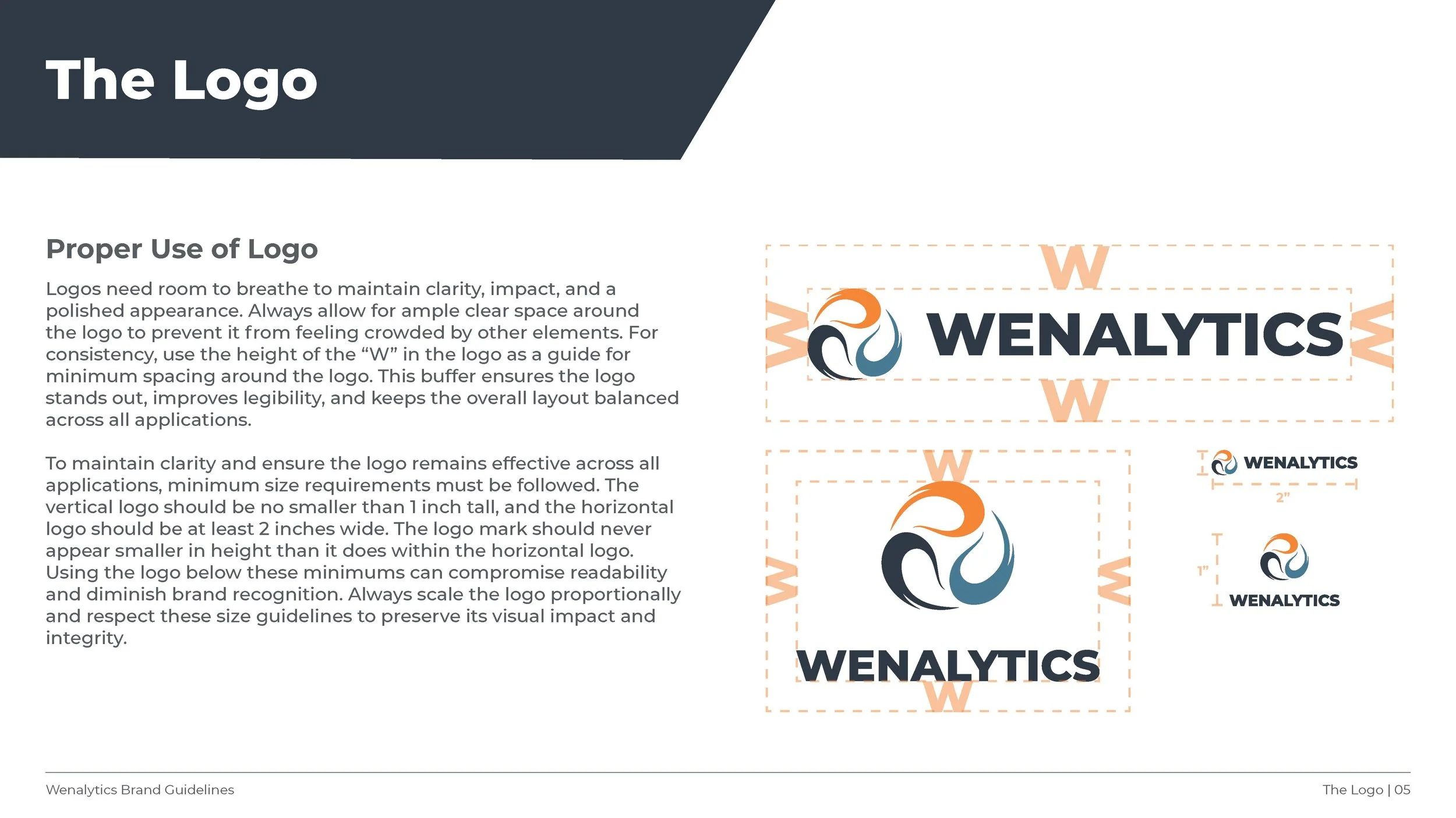
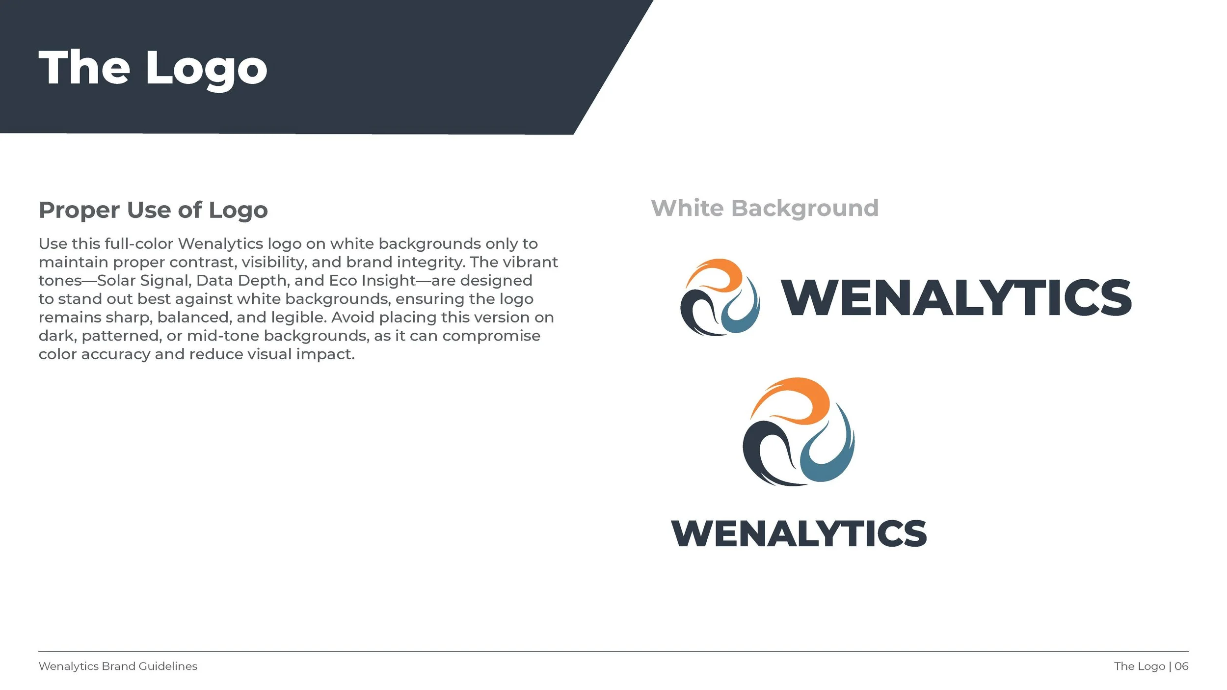
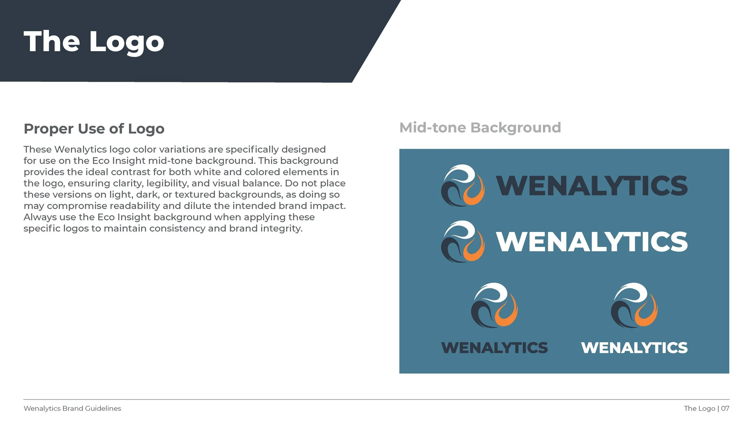
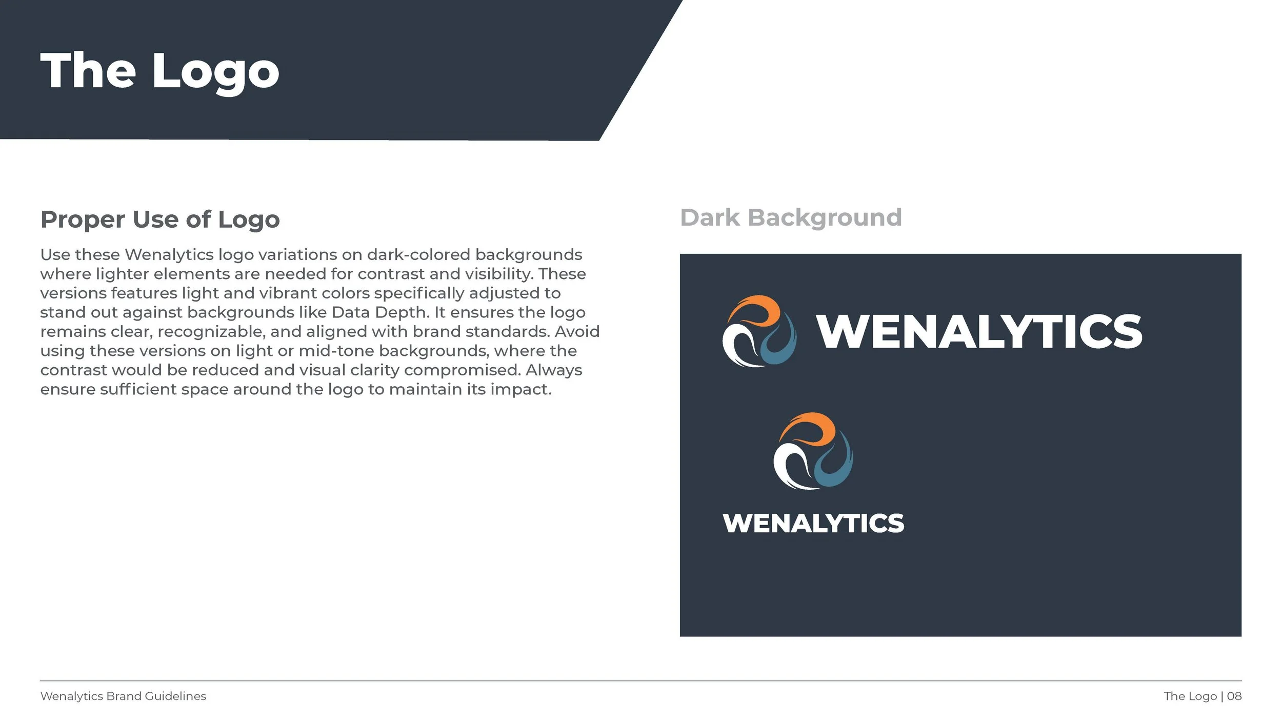
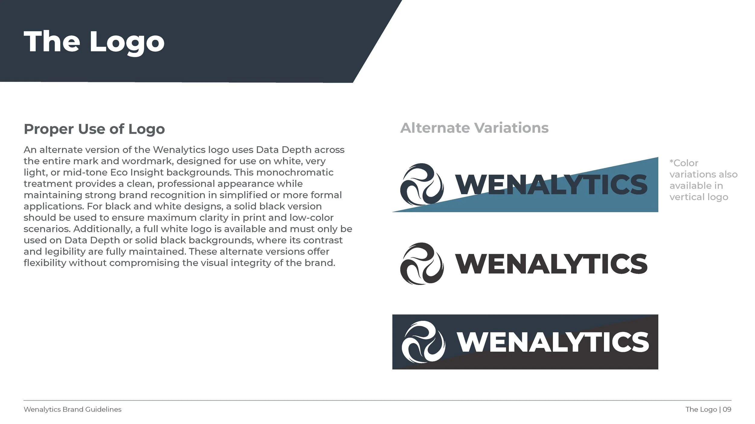
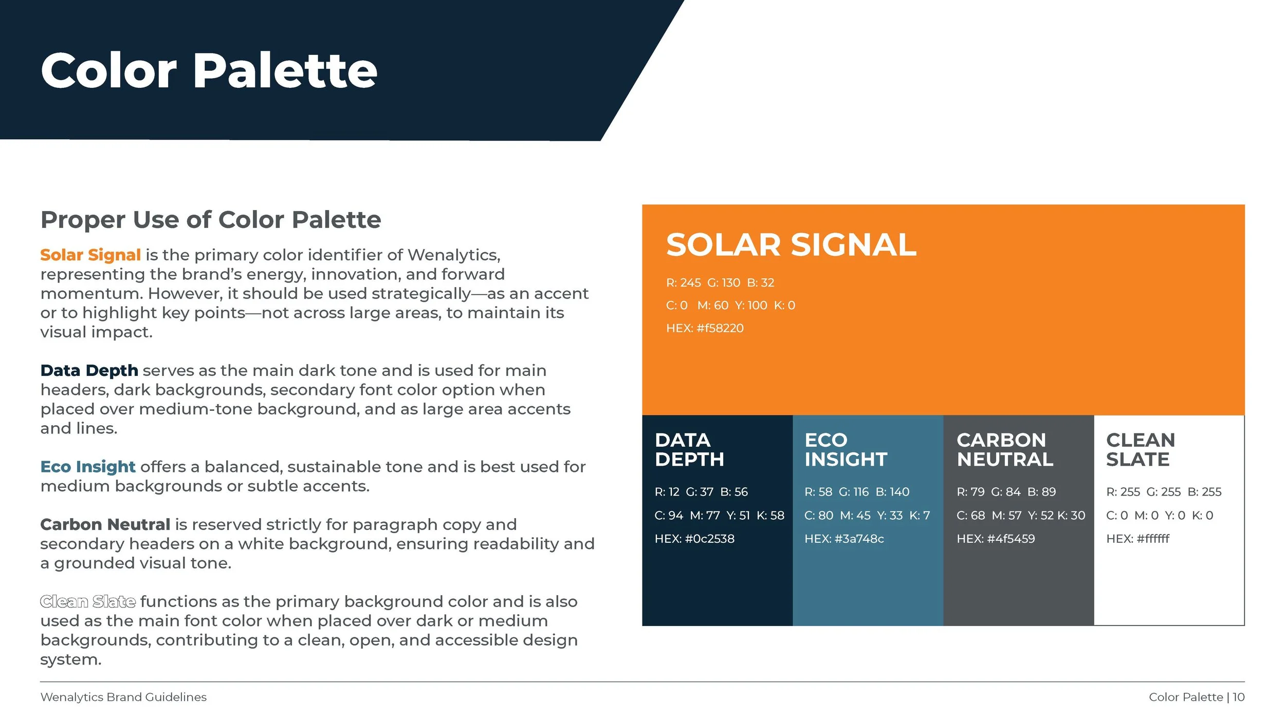
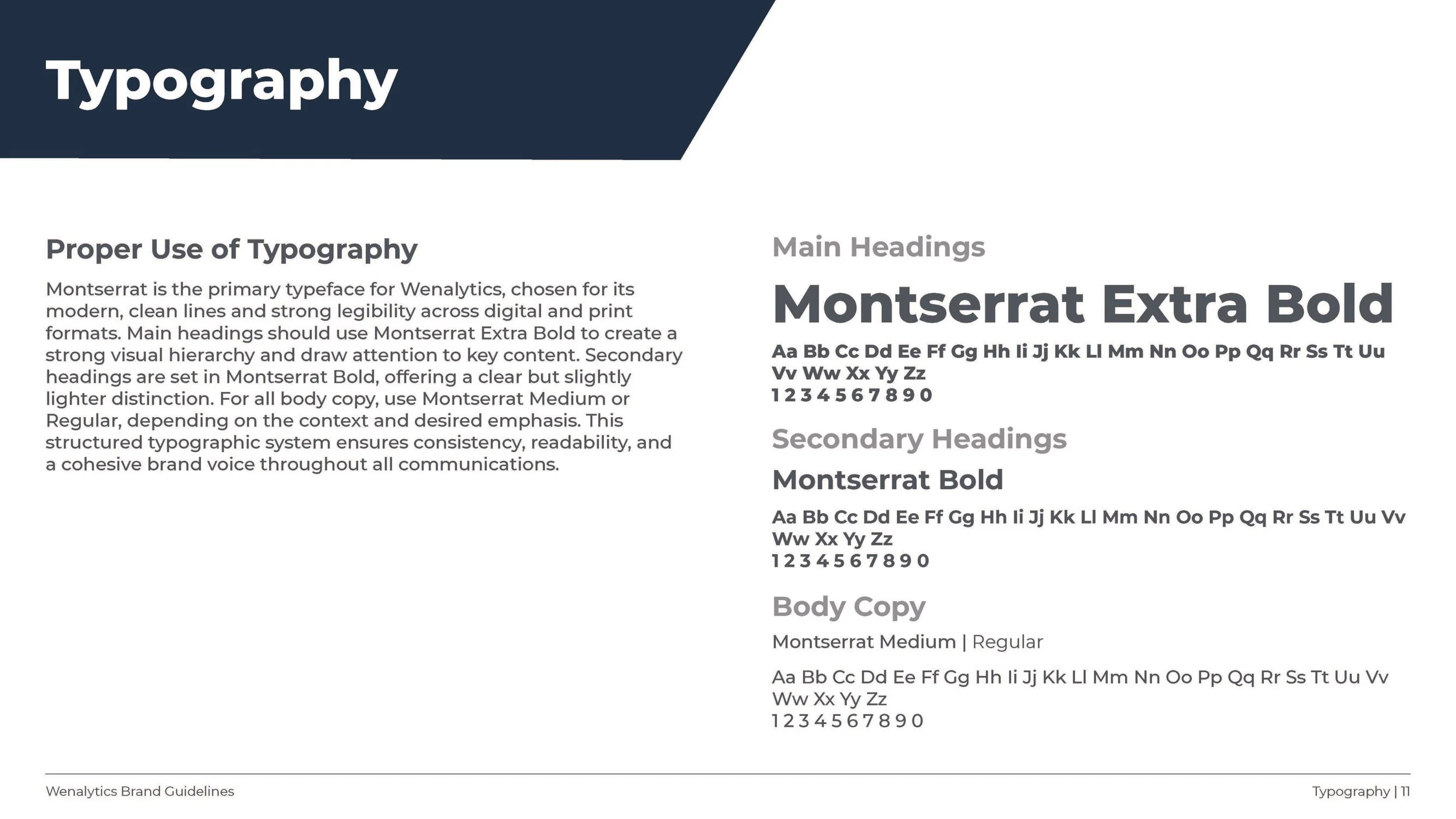
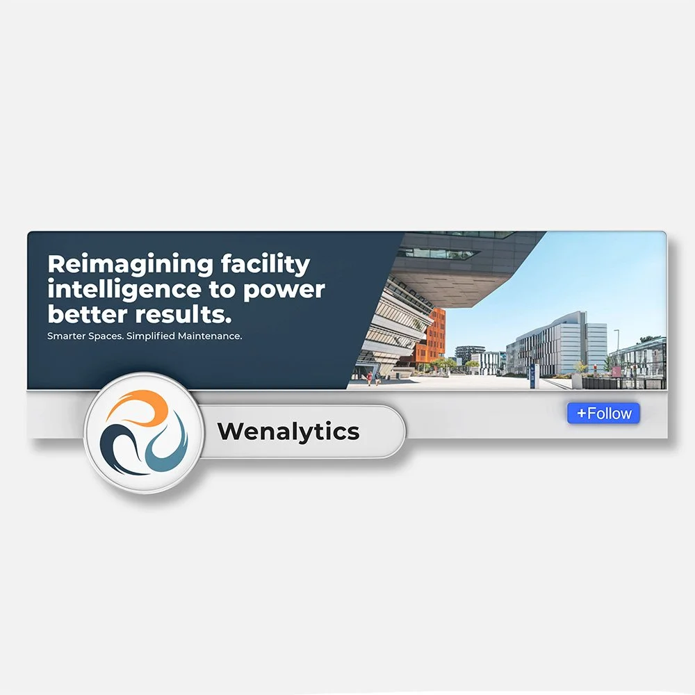
The company’s clean energy focus informed the visual language throughout the project, including the logomark, which drew inspiration from the recycling symbol and the motion of wind and air. The goal was to create a mark that felt purposeful and connected to the company’s mission. The client had a strong preference for the color orange, so the full palette was built around it, resulting in a system that felt energetic and distinctive while aligning with the forward-thinking nature of the brand. Detailed brand guidelines were developed to ensure consistency across all touchpoints, and the refreshed identity was applied across a suite of branded materials including sell sheets, letterhead, business cards, and a LinkedIn cover. I also contributed to shaping the visual direction of the new website to ensure the digital experience aligned with the updated brand identity.
-
Rebranding around a mission as specific and values-driven as clean energy required a thoughtful approach that honored the meaning behind the name Wenalytics and translated that purpose into a cohesive visual identity. This project deepened my understanding of how brand strategy and design work together to communicate a company’s evolving mission. Collaborating with a team throughout the process reinforced the importance of aligning strategy and design early so every deliverable, from the logo to the website, tells a consistent story.