Josh’s Lawn Care
Category
Logo Design
Print Design
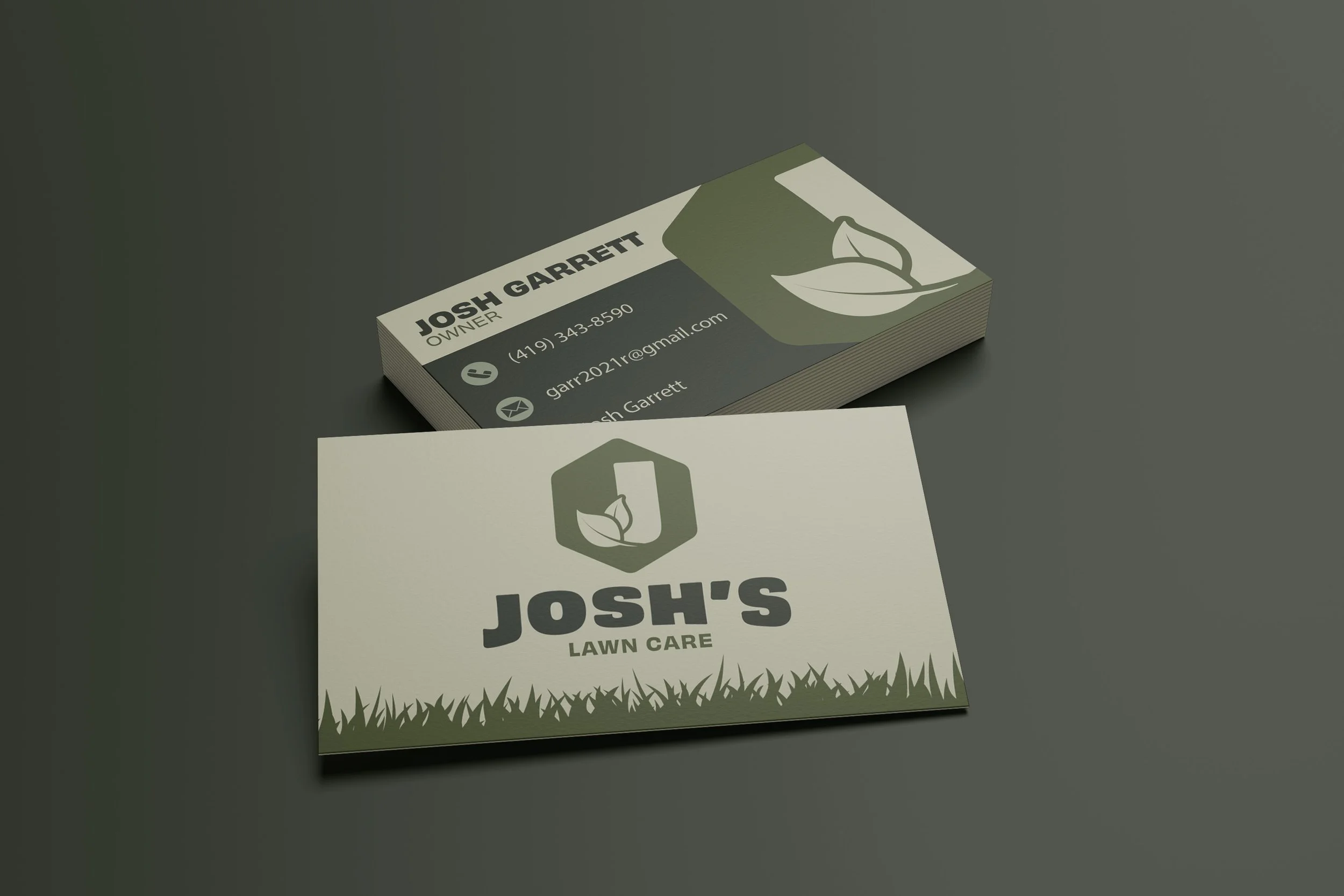
Josh's Lawn Care is a Toledo-based lawn care business looking to stand out in a crowded local market. For this project, I developed a full brand identity from the ground up, including logo design, a custom color palette, and business cards to establish a distinct and professional visual presence.
Project Overview